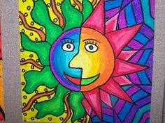
 We created our very own Aztec suns using warm and cool colours for contrast and using bright oil pastels for a look that pops!!!!  Colour Harmonies!!! Complementary This week we learned that colors that are opposite each other on the color wheel are considered to be complementary colors (example: red and green). The high contrast of complementary colors creates a vibrant look especially when used at full saturation. This color scheme must be managed well. Complementary colors are tricky to use in large doses, but work well when you want something to stand out.       On Thurs the 10th of September the two 5th classes came together to learn how to manipulate clay and make clay faces. In Religion we learned that each one of us is UNIQUE, this is shown in our finished products of our clay faces........ that each of us are different and special in our own way!!!!!
 On Thursday the 3rd of September the two classes came together for Art, our Art lesson was on how to use chalk pastels! We were inspired by the English poem we had been learning 'A Slash of Blue' by Emily Dickinson. The theme of the skyline and the colours of the sky came from this poem!!! We added the word PERSEVERANCE to remind ourselves this year that we must NEVER, NEVER, NEVER GIVE UP!!! As Martin Luther King said "I can accept failure but I can't accept not trying!"  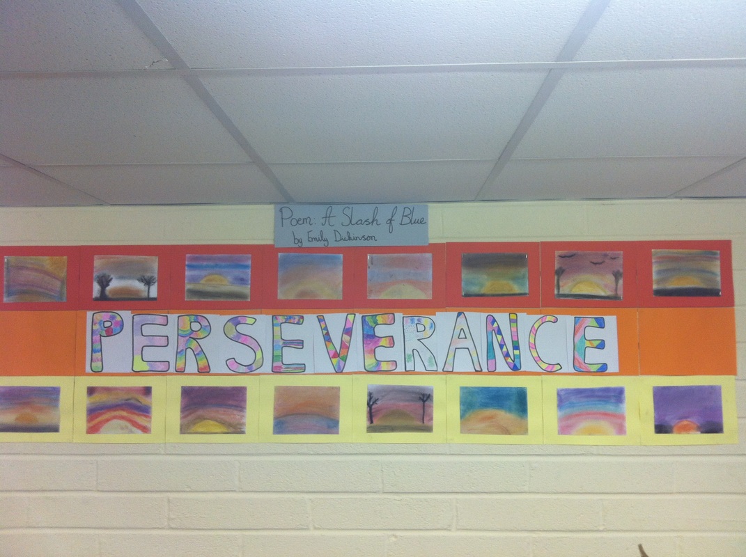  |


